How Notto built a brand worthy of its ambition
An intimate account of the thinking, tensions, and breakthroughs behind Notto's rebrand
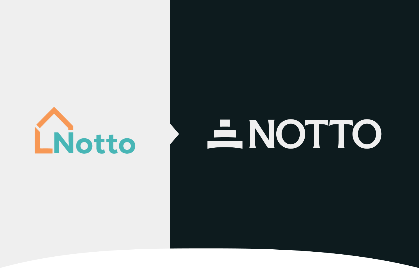
Most people only ever see a finished rebrand. They see the new logo, the colours, the typography, maybe even a new way of speaking. But what they don’t see are the tensions, trade-offs, and questions that shape what a brand can stand behind. This is that story.
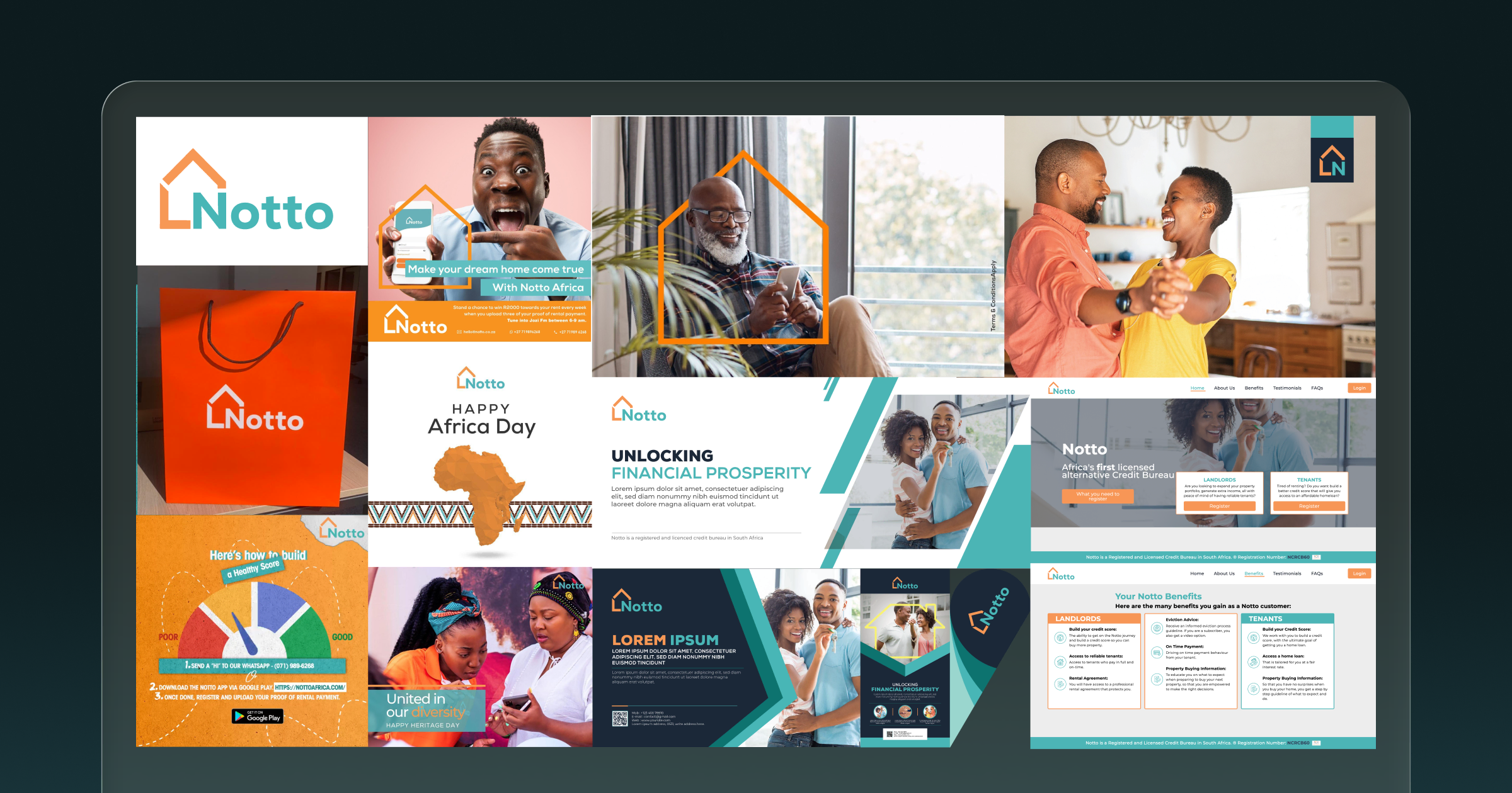
The start of the process was fairly straightforward. Notto had become a very different company, but its identity still reflected an earlier version of the business.
Notto started in 2020 as a specialised credit-scoring product for home loans. By 2024, it had become Africa's first licensed and regulated Alternative Credit Bureau. The business had also shifted from serving individuals directly to working with the institutions that shape access to credit, from banks and lenders to fintechs and telcos.
At that point, it became clear that the brand had fallen behind the company’s evolution. The company now needed to earn the confidence of risk officers, regulators, and the institutions shaping Africa's credit economy.
Still, we didn't want that push toward a more institutional brand to come at the expense of what had shaped the company from day one: the belief that expanding access to affordable, long-tenure credit can create greater economic prosperity for everyday people across Africa.
That meant every decision about our brand had to make Notto feel credible to the institutions it now worked with, but without losing sight of the people whose lives ultimately sit behind every credit decision.
The identity that came out of that process gives Notto the presence to stand alongside banks, lenders, regulators, and infrastructure partners, while still reflecting the belief that has always driven the company. If it does its job well, it encourages institutions to look at parts of the economy that have been there all along, just not fully seen.
Africa is emerging as one of the world’s most important economic frontiers, driven by fast-growing economies and the digital leapfrogging of entire industries. But that potential cannot compound without credit at scale. Credit is the lifeblood of every great economy, but only when the majority can access it.
Dalumuzi Mhlanga, Founder & CEO
That belief ended up shaping almost every decision we made.
Before we got into colours, symbols, or typography, we spent time trying to understand how the market already saw the problem. We agreed that every brand in one way or another reflects a way of seeing the world, whether it means to or not, and that felt like the better place to start. So we began by deeply understanding the world Notto was stepping into.
When Recognition Becomes a Trap
Words like underserved, excluded, thin-file, and unbanked all came from a real problem. They helped the industry describe a gap that needed attention. But they also reflected the way the industry had learned to think about risk.
Underserved describes a gap in access, but tells us very little about the value people are already creating every day. Excluded defines people by their relationship to a system instead of the economic lives they're already living. Thin-file compresses a much bigger story into what's absent from a credit record.
None of those terms are wrong; they just simply tell an incomplete story. One that, over time, reinforces a way of assessing risk by looking first at what's missing. The trouble is, when deficiency and absence are the starting point, it becomes surprisingly easy to miss the economic opportunity these markets represent.
Across Africa, millions of people earn, trade, save, repay, and transact every day. Their economic lives are neither empty nor invisible. They are simply illegible to the systems responsible for extending credit.
Because lenders lacked visibility into people's real economic lives, much of their creditworthiness simply went unrecognised. And that distinction changed everything, because once we stopped designing around absence, we could begin designing around the abundance that had been there all along.
The Visual Territories
Once we understood the problem as one of visibility rather than absence, the visual direction became much clearer. At that point, it didn't make sense to build the identity around exclusion. The more interesting question was how to show Human Economic Life in all its motion.
That meant creating a visual language with enough institutional weight to earn the confidence of banks, lenders, and regulators, while challenging the narrow lens through which traditional credit systems had learned to see people.
Every concept we explored began with the same conviction: value already exists. The work of Notto is to make it visible. From that belief emerged two distinct territories. The first explored the scale of the economic life being overlooked. The second explored the mechanism through which Notto makes it visible.
Territory One: An Ocean of Economic Life

The first territory imagined African economic activity as an ocean: vast, dynamic, layered, borderless, and rich with hidden value. It was a powerful frame because it was honest about scale. Across much of the continent, informal markets account for the overwhelming majority of economic activity.
In this world, Notto became the vessel that helps institutions navigate complexity, read currents, map terrain, and bring what lies beneath the surface. This direction gave a deeper expression of the opportunity and positioned Notto as the guide through an economy far larger and more dynamic than traditional credit systems had been able to recognise.
Territory Two: Real-World Behaviour in Full Spectrum

The second territory treated economic behaviour as light, and Notto as the prism that resolves it into its full spectrum.
It worked because it captured the real mechanism at the heart of the infrastructure. The signals of trust, consistency, and creditworthiness already exist in the way people earn, trade, save, repay, and transact. And just as a prism doesn't create light but makes visible the colours already within it, Notto makes visible the economic value already present in everyday life.
This direction positioned Notto as a source of clarity, precision, and truth. It also gave us a visual language of spectrum, triangles, refraction, and form. Most importantly, it made our central belief explicit: we do not create value. We make existing value visible.
The Mark
The logo takes its form from the prism because it captures Notto's role more honestly than any other symbol we explored. Its triangular geometry expresses refraction and clarity. The stacked construction gives the mark presence and stability, reflecting Notto's role as the infrastructure that supports credit decisioning at a continental scale.
The Colour System
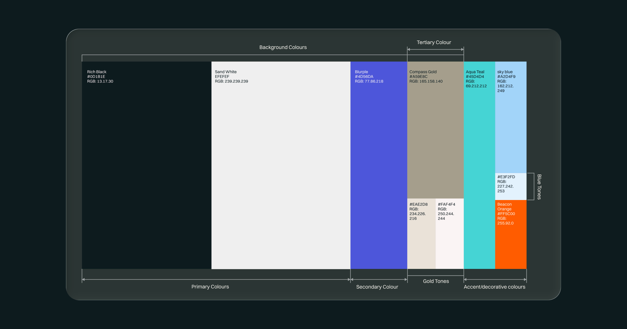
Colour was one of the places where we had to hold both sides of the brand together. It needed to feel credible enough for the institutions Notto now worked with, while still leaving room for the imagination at the heart of the company.
So, we built the primary palette around Rich Black and Sand White. Clean, disciplined, and assured. They gave the identity a sense of confidence without feeling cold, and created the kind of presence that felt at home with banks, lenders, regulators, and the wider financial ecosystem.
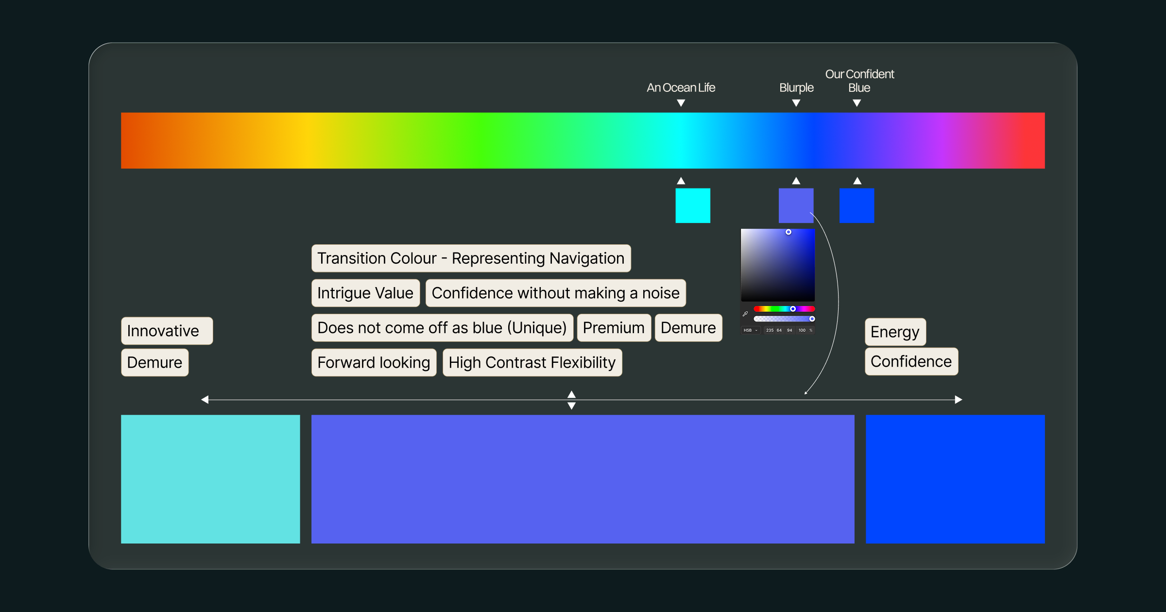
The secondary palette came from the territories. We began with blue, drawn from the depth and trust of the Ocean of Economic Life. But blue alone felt too familiar within the category. So we returned to the spectrum and found something more ownable: Blurple — a blue edged with purple. It carried the confidence of blue, with the distinctiveness and forward energy of something new. That balance made it the natural foundation of the wider colour system.
The Spectrum
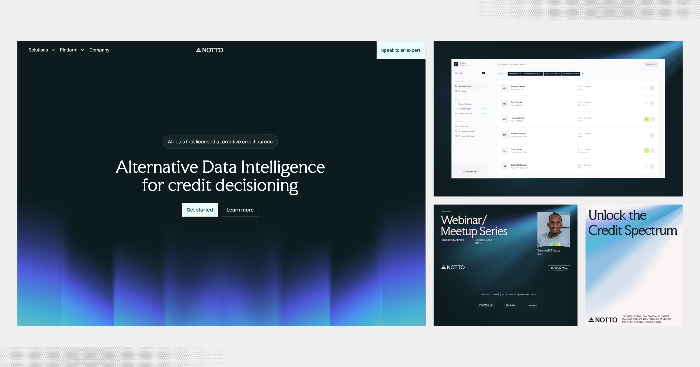
The Spectrum is the primary visual expression of the brand. It is inspired by light passing through a medium, the same logic behind the prism. Raw input enters a system, and what emerges is structured insight. Light represents data. The medium represents Notto’s systems. The spectrum represents organised intelligence.
The Capture
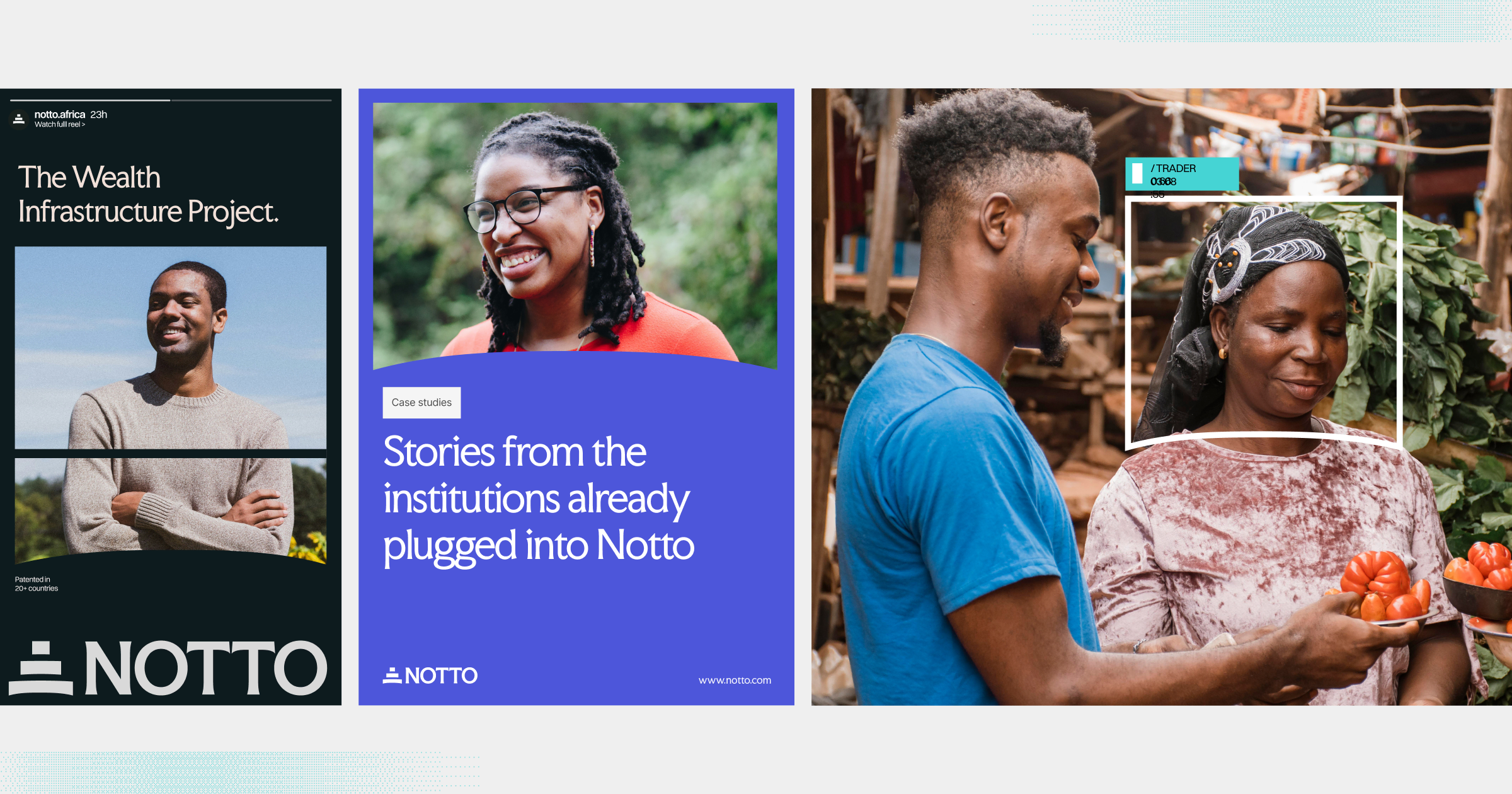
Capture’ is a photographic device used across Notto’s imagery. It frames people within real economic environments as full participants in economic life. Its central insight is that the signals institutions rely on are only traces of a life in motion.
Behind every data point is a person earning, trading, saving, repaying, and building a livelihood with a depth no single metric can contain. Capture makes that fuller reality visible, ensuring the work never reduces people to just scores.
The device appears in two forms: as a framing stroke across imagery, and as a container for photographic composition.
The Pixel
Our pattern system begins with the pixel: the smallest unit of an image.
It reflects how Notto works. Real-world behaviour appears first as fragmented signals. Individually, each reveals only part of the story. Brought together, they form patterns. And those patterns create a clearer picture of economic life.
The pixel system carries that idea across the brand, adding depth, rhythm, and structure to every surface.

A Brand Built to Carry the Work
By the time we were finished, with the thoughtful facilitation of our branding partners at FourthCanvas, the identity finally felt like it belonged to the company Notto had become. It could carry the weight of the work, reflect the conviction behind it, and help the market see the business a little more clearly.
In the end, what mattered most was that the identity finally expressed the belief that has always been at the heart of Notto: when Human Economic Life is seen more fully, credit becomes more intelligent, more inclusive, and more expansive.